Baka Jewelry
Branding for a slow-designed, ethically-handcrafted, contemporary, sustainable jewelry brand.
Logo Refinement, Collateral Design


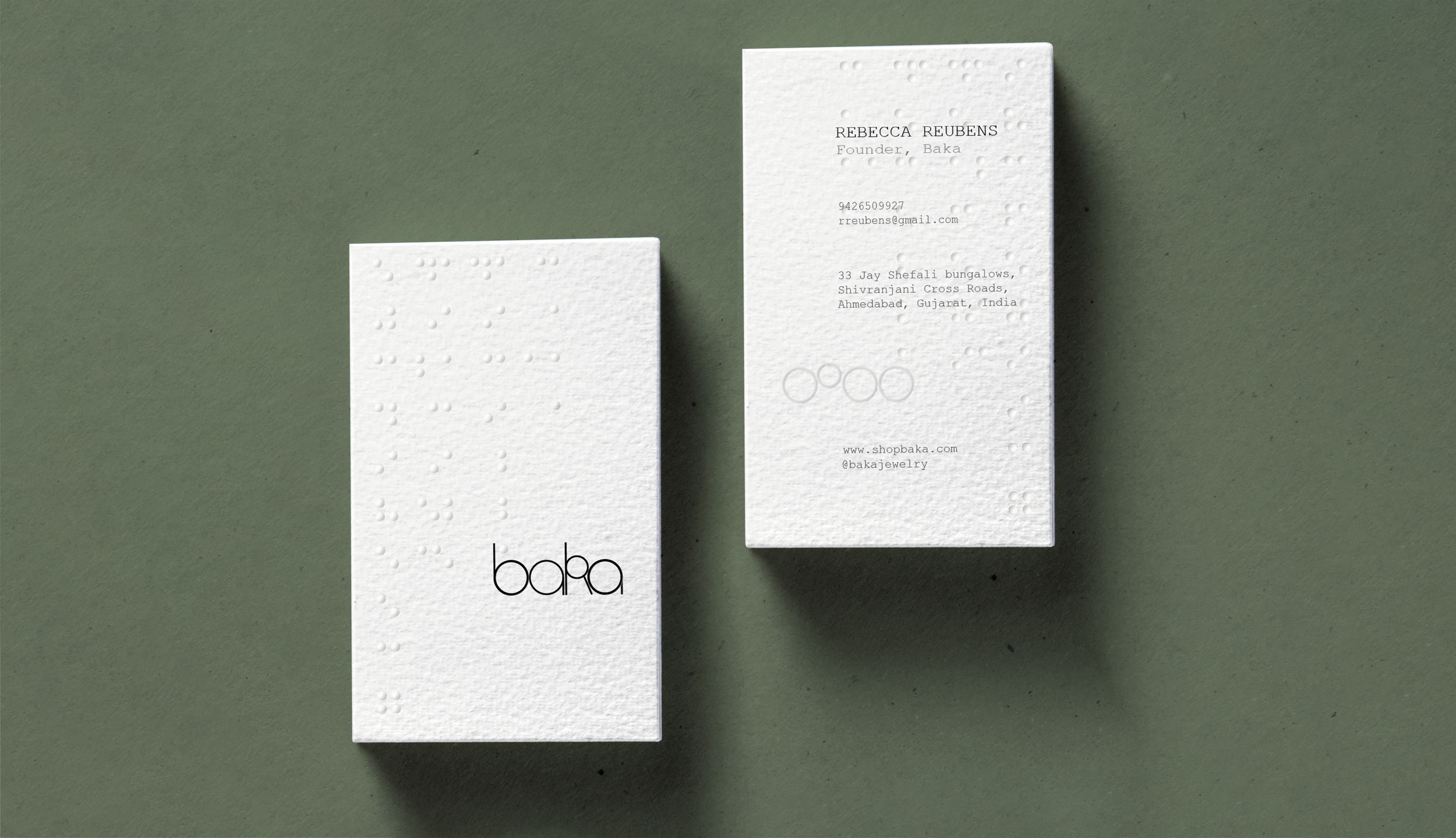
Since Baka is a sustainable brand, I wanted the visiting card to reflect this value. I researched different sustainable papers, fonts and printing techniques.
Paper: Handmade paper made from cotton scraps, locally sourced from Kalam Kush, a paper-making workshop near Gandhi Ashram in Ahmedabad.
Font: Courier New is a font designed initially for typewriters so it was designed to save ink, making it a sustainable font.
Printing Techniques: Blind embossing does not require ink and does not affect the recyclability of paper. These elements visually and tactilely contribute to the handcrafted nature of the jewelry.
The layout is inspired by the Japanese aesthetic on account of the brand name Baka, which along with being an endearing slang in Gujarati, is the Japanese word for fool. The idea of being a fool resonates with her journey—the fool did not know it was impossible and so she did it.


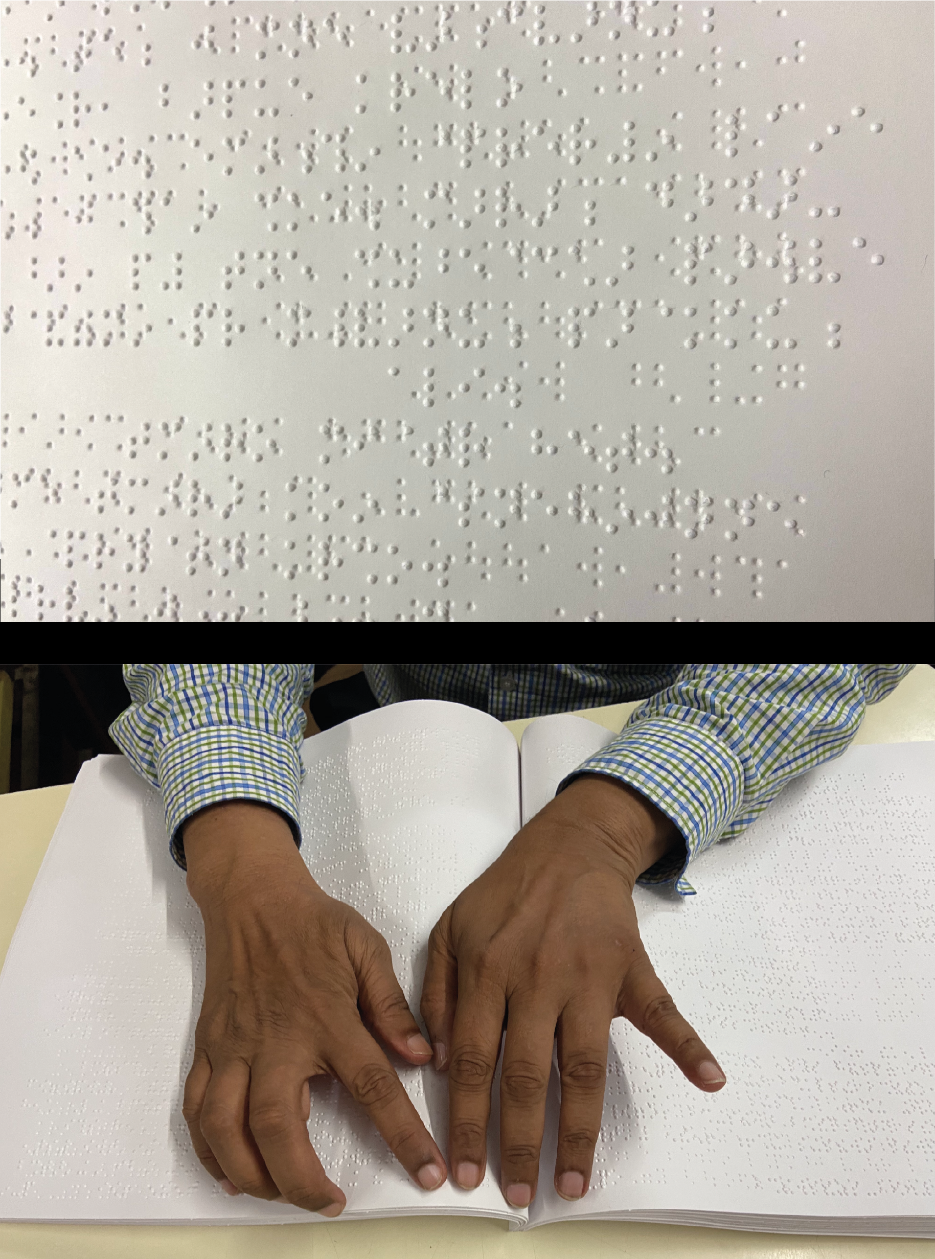
Research at the Blind People’s Association, Ahmedabad talking to Mr. Chandrakant Solanki, who is a braille expert there

