Formal Interference
Reimagining the form of cigarette packaging to introduce formal interference to discourage smoking.
Form Study, Prototyping
How can we leverage methods of communication to influence positive change?
Focusing on this inquiry, I reimagined the cigarette packaging in India, as a five-day micro project.

The current labeling regulations require the packaging to have pictorial health warnings on 85% of the front and back. This presented a question about the effectiveness of fear-based packaging.
Is fear based packaging the only solution?
USER FRICTION
/anything that keeps a user from accomplishing a desired action on a website or app.
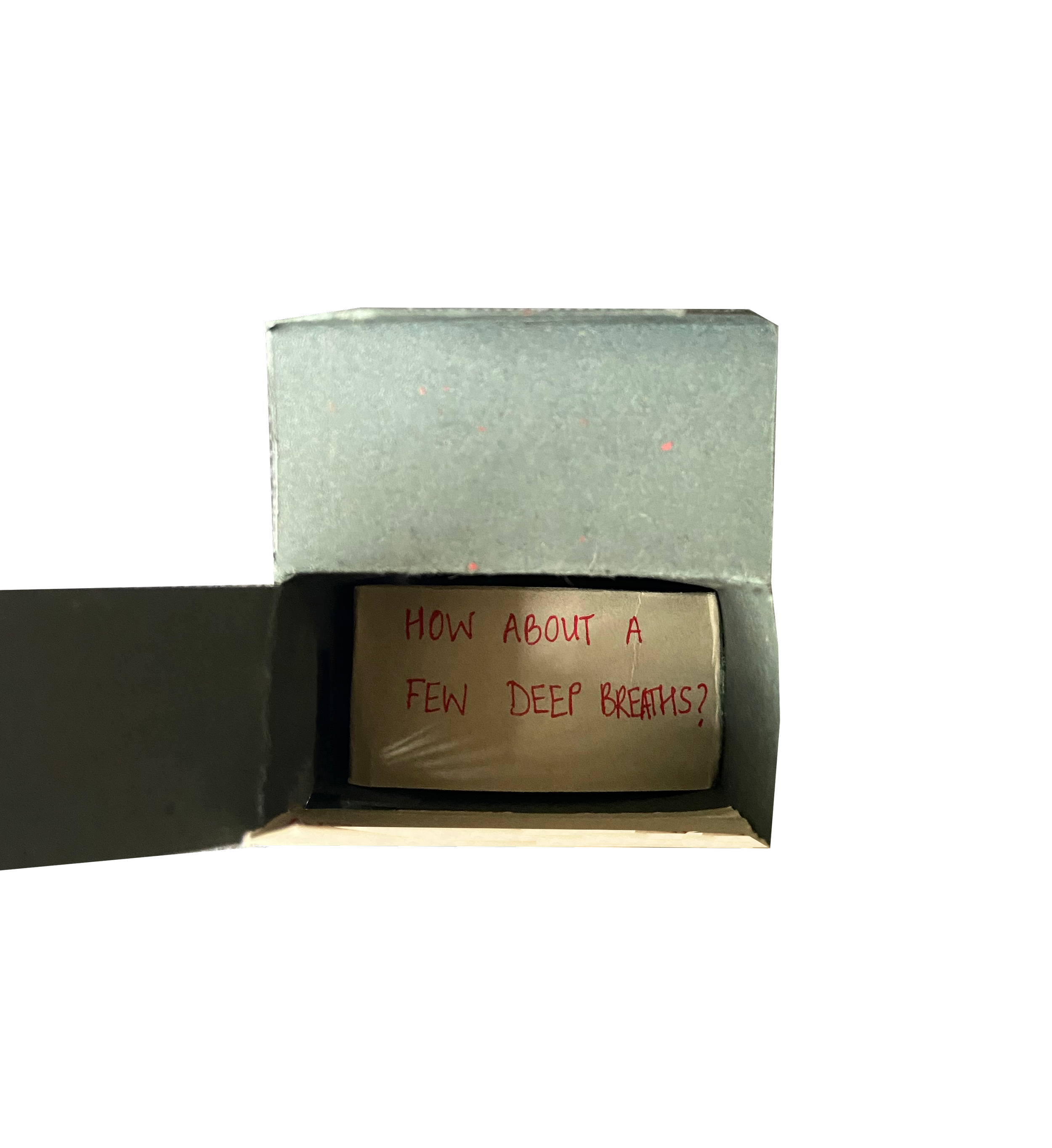
Applying this interaction design principle to packaging design, I wanted to make the process of reaching a cigarette less accessible, difficult to carry, repetitive and frustrating while suggesting techniques for quitting along the way.
PROTOTYPE 1
The symmetrical shape disorients the user since there are no clear indications of where the box opens from.

PROTOTYPE 2
Again, the symmetrical shape disorients the user since there are no clear indications of where the box opens from. The form also makes it difficult to carry around.

PROTOTYPE 3
The additional flaps make the process of reaching the cigarette repetitive. Each flap has a suggestion of a quitting technique which the user sees every time they open the box.